[Tutorial] Building a County Level Choropleth with a Custom Colorbar with Python and Plotly
by Andrew Fulton
In this tutorial I will demonstrate how to make a county level choropleth with a custom colorbar using Python and Plotly. Much of the material in this tutorial can be found in Plotly’s County Level Choropleth in Python tutorial, with the notable difference being that this tutorial will use a custom colorscale to indicate population of each county. Please see the tutorial linked above on downloading Plotly and getting a Mapbox Access Token.
Getting the Data
I will be using Colorado’s county population data for this tutorial. This data that I will be using has been generously provided by Colorado’s state government and can be downloaded from here. The website that provides the geojson files with county geolocation data is CivicDashboards, and the specific colorado county geolocation dataset can be downloaded from here.
Let’s begin
First begin by importing the python libraries you will need.
note: I am importing os here because I have my Mapbox Access Token saved in my .bash_profile, it may not be neccessary for you to do this.
import pandas as pd
import json
import plotly.plotly as py
import plotly.graph_objs as go

import os
Next I will read in the data. I will be using pandas for handling data in this tutorial.
# read in population data
df = pd.read_csv('Population_Colorado.csv')

# read in county border data
with open('colorado_counties.geojson') as f:
    counties = json.load(f)
Since the population data is broken out by county, year, and age, I want the sum of the population for each county and year ignoring age. To do this, I group the data by county and year and get the sum. I also drop the columns I don’t care about.
full_df = df.groupby(['county', 'year'], as_index=False).sum()
full_df.drop(['fipsCode', 'age', 'malePopulation', 'femalePopulation'],
             inplace = True, axis=1)
You should now have a dataframe, full_df, that looks something like this:
| county | year | totalPopulation |
|---|---|---|
| Adams | 1990 | 265709 |
| Adams | 1991 | 273620 |
| Adams | 1992 | 281386 |
| … | … | … |
In this tutorial, I am only interested in the data for 2015 though, so lets isolate the data for that year.
df_2015 = full_df[full_df['year'] == 2015]
Now you should have a df_2015 dataframe that will look like this:
| county | year | totalPopulation |
|---|---|---|
| Adams | 2015 | 487571 |
| Alamosa | 2015 | 16202 |
| Arapahoe | 2015 | 627056 |
| … | … | … |
Next I want to add a column to my population dataframe that will contain the geographical data. I will begin by checking the name of each county from the geojson file and making sure that it is in the population dataframe and if so, adding it to a dictionary where the key will be the county name and the value will be the geographical data for the county. If a county name from the geojson data is not in the population dataframe it is printed out so that the issue can be reviewed further.
# initialize a dictionary
geo_dict = {}

for x in range(len(counties['features'])):
    # I ignore the last eleven characters in the name since the geojson file includes ' County, CO' in the county names and the population data does not
    name = counties['features'][x]['properties']['name'][:-11]
    if name in df['county'].unique():
        geo_dict[name] = counties['features'][x]
    else:
        print 'not in: ', name
Once I have my dictionary of geolocation data in order, I want to make it into a pandas series to make it easy to join to my population dataframe
ser = pd.Series(geo_dict.values(), index = geo_dict.keys())
ser.name = 'coordinates'
finally I join the geolocation data to the population dataframe
df_2015 = df_2015.join(ser, on='county')
now df_2015 should look something like this:
| county | year | totalPopulation | coordinates |
|---|---|---|---|
| Adams | 2015 | 487571 | {u’geometry’: {u’type’: u’MultiPolygon’, u’coo… |
| Alamosa | 2015 | 16202 | {u’geometry’: {u’type’: u’MultiPolygon’, u’coo… |
| Arapahoe | 2015 | 627056 | {u’geometry’: {u’type’: u’MultiPolygon’, u’coo… |
| … | … | … | … |
At this point I need to figure out the colors I will use. Ideally, I would like a pretty diverse scale to really show the differences between the populations for each county. To do this, I use Chroma.js Color Scale to get a hundred separate color values in the shades that I want, so that I can have a separate shade for each 10,000 people in a county. Also, I will need 101 colors to make it easy to map the colors on a scale from 0 to 1 for Plotly’s colorbar feature, so I just repeat the last item of the list twice. I than zip the list into a dictionary
colors = ['#ffffe0','#fffddb','#fffad7','#fff7d1','#fff5cd','#fff2c8',
          '#fff0c4','#ffedbf','#ffebba','#ffe9b7','#ffe5b2','#ffe3af',
          '#ffe0ab','#ffdda7','#ffdba4','#ffd9a0','#ffd69c','#ffd399',
          '#ffd196','#ffcd93','#ffca90','#ffc88d','#ffc58a','#ffc288',
          '#ffbf86','#ffbd83','#ffb981','#ffb67f','#ffb47d','#ffb17b',
          '#ffad79','#ffaa77','#ffa775','#ffa474','#ffa172','#ff9e70',
          '#ff9b6f','#ff986e','#ff956c','#fe916b','#fe8f6a','#fd8b69',
          '#fc8868','#fb8567','#fa8266','#f98065','#f87d64','#f77a63',
          '#f67862','#f57562','#f37261','#f37060','#f16c5f','#f0695e',
          '#ee665d','#ed645c','#ec615b','#ea5e5b','#e85b59','#e75859',
          '#e55658','#e45356','#e35056','#e14d54','#df4a53','#dd4852',
          '#db4551','#d9434f','#d8404e','#d53d4d','#d43b4b','#d2384a',
          '#cf3548','#cd3346','#cc3045','#ca2e43','#c72b42','#c52940',
          '#c2263d','#c0233c','#be213a','#bb1e37','#ba1c35','#b71933',
          '#b41731','#b2152e','#b0122c','#ac1029','#aa0e27','#a70b24',
          '#a40921','#a2071f','#a0051c','#9d0419','#990215','#970212',
          '#94010e','#91000a','#8e0006','#8b0000', '#8b0000']

scl = dict(zip(range(0, 101), colors))
Now that I have my color dictionary scl, I can map the colors to the population in a new color column on my df_2015 dataframe. I first write a function to do this and than apply it to the dataframe.
def get_scl(obj):
    frac = obj / 10000
    return scl[frac]

df_2015['color'] = df_2015['totalPopulation'].apply(get_scl)
After doing this, df_2015 should look like this:
| county | year | totalPopulation | coordinates | color |
|---|---|---|---|---|
| Adams | 2015 | 487571 | {u’geometry’: {u’type’: u’MultiPolygon’, u’coo… | #f67862 |
| Alamosa | 2015 | 16202 | {u’geometry’: {u’type’: u’MultiPolygon’, u’coo… | #fffddb |
| Arapahoe | 2015 | 627056 | {u’geometry’: {u’type’: u’MultiPolygon’, u’coo… | #e35056 |
| … | … | … | … | … |
At this point we can start getting data together for the plotly diagram. With county level data in plotly and mapbox, the county geolocations and colors are plotted as layers using a list of dictionaries inside the layout dictionary object, of which I will go into more detail in a moment. Let’s make our layers list.
layers_ls = []
for x in df_2015.index:
    item_dict = dict(sourcetype = 'geojson',
                     source = df_2015.ix[x]['coordinates'],
                     type = 'fill',
                     color = df_2015.ix[x]['color'])
    layers_ls.append(item_dict)
So for each county in the df_2015 dataframe we append a dictionary to our list of layers, layers_ls, that says the source type (geojson), the source (our geolocations for each individual county), the type (fill to fill in the color), and the color to fill it with.
let’s also go ahead and make a variable with our mapbox access token. Since mine is saved in my .bash_profile, I access it as such:
mapbox_access_token = os.environ['MAPBOX_AT']
Plotly works largely with dictionaries and Plotly subclass dictionaries from the graph_objects module nested within each other. The documentation for these objects can be found here.
Essentially you will make a plotly figure using a dictionary with a data dictionary and a layout dictionary nested within it. To do county level choropleths with custom map objects, all of your actually plotting will be done in your layout dictionary. However, to add a colorscale, all your colorscale data must be in a data dictionary.
Before we can make our data dictionary though, we must have out colorscale in the right format. Right now we have our colors saved into our scl dictionary, but to make a custom colorscale, they must be in a list. The first item of the list needs to be a sublist that looks something like [0, '#fffddb'] and the last item should look something like [[1, '#8b0000']. It is really important that the first sublist start with 0 and the last sublist start with 1. If they do not, your colorscale won’t show up, and plotly will display its own standard colorscale in its place. I use my original color list colors to make my new colorscale list.
colorscl = [[i * .01, v] for i,v in enumerate(colors)]
It should look something like this: [[0, '#fffddb']...[1, '#8b0000']]
Next I will make my data dictionary using graph_objects dictionary subclass go.Data. Since you don’t actually want your markers to show up, you only need them there to put in a colorscale, just put them at a random latitude and longitude that won’t show up in your image. I use lat:0 lon:0 which is somewhere in central west Africa. the marker dict is the most important part here. cmax is how highest value the scale on your colorbar will show, and cmin is lowest. color is where you define the range between cmax and cmin. colorscale is where you put your colorscale list. Make sure showscale is True and autocolorscale is False. For colorbar use a go.ColorBar dictionary subclass where you can adjust the length of your colorscale with len. You can also set a title and do other things here. Unfortunately, the title and colorbar layout aren’t as customizable as I would like so I’m not using a lot of the features here. See the documentation for more info.
data = go.Data([
            go.Scattermapbox(
                    lat = [0],
                    lon = [0],
                    marker = go.Marker(
                                  cmax=100,
                                  cmin=0,
                                  colorscale = colorscl,
                                  showscale = True,
                                  autocolorscale=False,
                                  color=range(0,101),
                                  colorbar= go.ColorBar(
                                                 len = .89
                                                        )
                                       ),
                    mode = 'markers')
                     ])
Next I make my layout dictionary using the graph_objects dictionary subclass go.Layout(). Play around with the height, width and zoom, as well as the lat and lon in the center dictionary of the mapbox dictionary to get your plot viewing correctly. I have things set here to view Colorado well.
layout = go.Layout(
    title = 'Colorado 2015 Population (x 10,000)',
    height=1050,
    width=800,
    autosize=True,
    hovermode='closest',
    mapbox=dict(
        layers= layers_ls,
        accesstoken=mapbox_access_token,
        bearing=0,
        center=dict(
            lat=39.03,
            lon=-105.7
        ),
        pitch=0,
        zoom=5.5,
        style='light'
    ),
)
Finally I can build the figure saving it where you like. Again you may want to play around with the width and height variables.
fig = dict(data = data, layout=layout)
py.image.save_as(fig, filename='image/test.jpeg',
                 width = 750, height= 575)
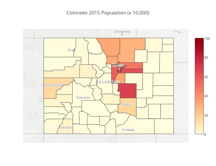
Now my image is saved in the location I specified [current directory]/image/test.jpeg. If you followed with this tutorial exactly, this should be your result:
Subscribe via RSS